← Portfolio

Fanhaven

Building business intelligence for live events.

Role

UX Designer,
UX Researcher

Timeline

July - August 2025

Team

1 Design Intern,
1 Chief Design Officer

Tools/Skills

Figma,
UX Research

The Challenge

As a company specialized in the live events space, Fanhaven presented a problem specifc to the live music industry and potential for improved fan experiences and artist engagement. How might we design a POS system that seamlessly balances simplicity for event staff with the complexity of real-time ticketing, merchandise, and financial reporting needs?

Solution

A POS experience highly tailored to the live music industry that empowers merch teams to, process transactions for a seamless digital payment experience, as well as onboard the system with minimal training for both small pop-up events and large-scale concerts without compromising workflow.

Key Insights

  • High-volume environments: Staff needed to process transactions quickly during short intermissions or peak crowd surges.
  • Ease of onboarding: Many merch staff are temporary/seasonal hires, so the system had to be intuitive with almost no training required.
  • Scalability: The system had to work for both small pop-up events and large-scale concerts without changing the workflow.

Through conversations with stakeholders in the music and live-events ecosystem, we identified key frustrations in merchandising workflows.

From our findings, some of the recurring pain points emerged include, significant revenue leakage from merch loss (in one case, up to 50%), complex UI systems, and unreliable inventory tracking.

These findings validated the need for a system designed specifically for high-pressure live event environments.

Key Design Decisions

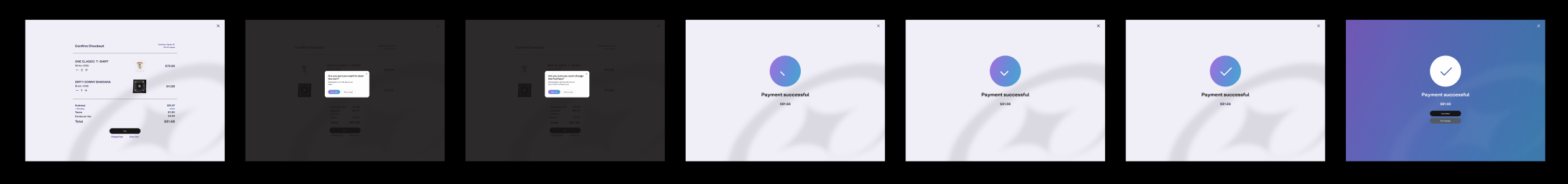
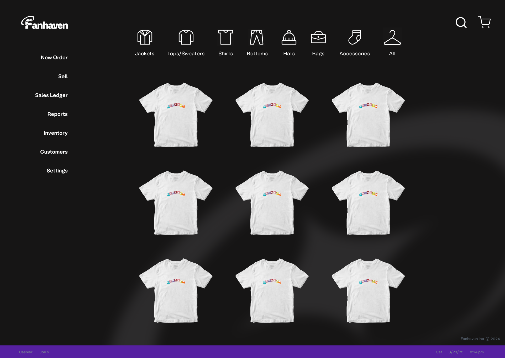
Design Exploration - Interface Simplification

How can we create an intuitive UI with simple and clear information architecture for a POS system?

From user research and competative analysis, it was clear other solutions have complicated UI's with steep learning curves. These cause users to feel overwhelmed and frustrated, leading to decreased efficiency and increased errors in high-intense environments.

Initially, we focused on the core functionalities, and where in the process we might implement Fanhaven’s design system features.

To find the most glanceable, touch-friendly interface for merch staff in loud, crowded environments, early explorations tested:

  • different layout structures for faster product selection — e.g., grid-based vs. list-based item displays — to find the most glanceable, touch-friendly interface for merch staff in loud, crowded environments.
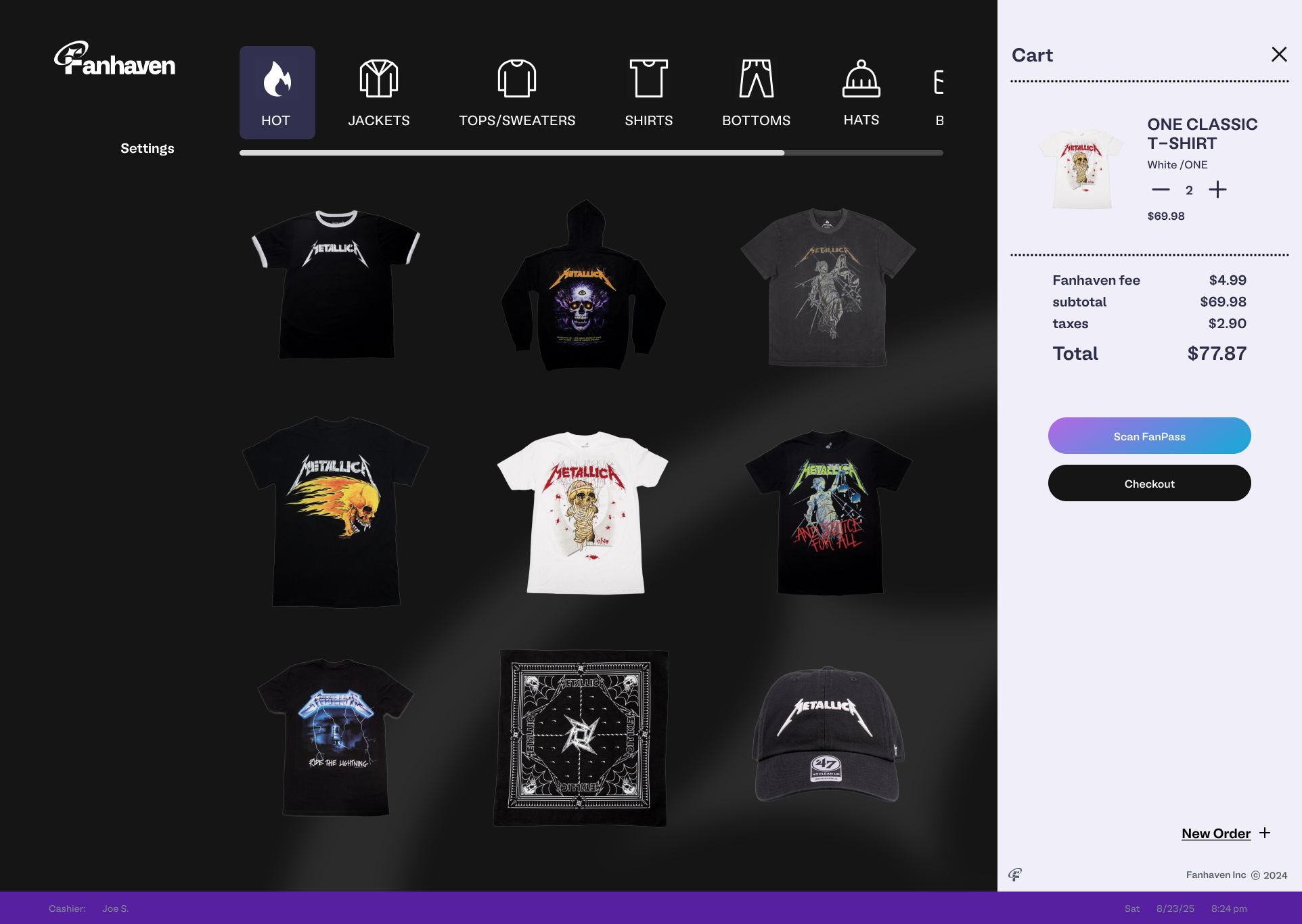
  • a flow without certain features offered in the cart.

Ultimately, we aimed to improve efficiency with a simple, easy to read grid display including item icons, retaining only a settings button to reduce errors in high-intense environments.

finalposcart

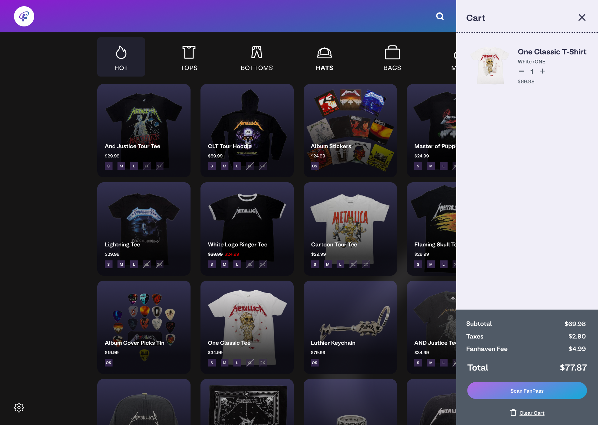
Final version of the POS system with a cart view.

Design Exploration - Checkout Flow Variations

Providing a simple checkout experience for merchants.

We discovered during live events, merch sellers often faced long lines and limited time windows to process payments. We wanted to provide a more concise checkout flow for the merchant, improving overall checkout efficiency.

We wanted to provide users with a fast and intuitive checkout experience optimized for event environments, incorporating larger touch targets and streamlined scanning functionality.

cartflow

Design Exploration - Microinteractions & Feedback States

Feedback that feels instant.

From our research, we learned how merchants often experienced uncertainty when confirming transactions due to delayed system feedback or unclear visual states.

We wanted to explore how microinteractions and visual feedback could provide immediate clarity and confidence at every step of the checkout flow.

Several feedback types were explored:

My Role and Contributions

As a design intern under the direct guidance from the CDO, I worked closely with cofounders across visual systems, product design, and user research to ensure the design was implemented correctly and efficiently. My contributions included:

Initial3x3

Early version with a 3x3 Grid POS Screen.

posv1

First iteration of the POS system.

Results

Understanding a POS system has never been easier.

A seamless POS experience for both small shows and large tours, with considerations for employee onboarding, dynamic inventory updates, and flexible category layouts.

Checkout with ease.

Checkout in seconds with a flow designed to minimize friction and maximize speed during live events. By condensing the process into a clear Scan → Confirm → Pay sequence, staff could complete transactions in under 30 seconds.

Reassurance at every tap.

The refined microinteractions provide clear visual confirmation for every action, reducing transaction errors and boosting staff confidence during rush periods.

finalposcreens

Final version of the POS system with a 3x3 Grid POS Screen.

Takeaways

Simplicity wins.

Merch teams at live events need to move fast, especially in high-pressure environments. If the POS feels cluttered or takes too many clicks, transactions slow down and lines grow. Designing with minimal steps and clean alignment rules ensures smooth, stress-free use.

Iterate. Iterate. Iterate.

Throughout the design process, it's important to iterate as much as possible up until the deadline. There's no such thing as “perfect”, as there will always be room for improvements. In the end, time the only thing that determines work from being completed. Through iteration, it ensures that the design is as polished and ready within those constraints.

Design in Systems.

Rather than designing something new every time, it's essential to understand the importance in designing in systems. Approaching design projects with a system-thinking frame of mind, makes it easier to scale new features or recycle design assets for other uses without reinventing the wheel.

Reflection

Working on the Fanhaven POS system gave me the opportunity to grow as both a designer and collaborator. I learned how important it is to design with systems in mind, ensuring that alignment, typography, and interaction rules were consistent across the experience.

The process challenged me to think critically about how design decisions affect usability in real-world, high-traffic environments like event merchandising. While there were hurdles, such as balancing simplicity for end users with the complexity of back-end requirements, the project reinforces the value of iterative feedback, documentation, and teamwork in shaping a product that feels both intuitive and scalable.

Next Steps

Moving forward, the POS system will continue to undergo user testing, with iterations guided by further research and development feedback.